The wrong color against your skin doesn’t just look off — it quietly drains your confidence before you’ve even left the room.
Most people spend years chasing the perfect lingerie color guide without realizing the real variable isn’t the color itself. It’s the biological undertone beneath their skin. According to Healthline, skin undertones — cool, warm, or neutral — are more critical for color matching than your actual surface shade. That single insight changes everything.
Undertone vs. Tone — what’s the difference?
- Tone (also called surface shade) is what you see: fair, medium, deep, or anything in between. It shifts with sun exposure, seasons, and inflammation.
- Undertone is the fixed pigment layer beneath the surface — the biological baseline that never changes, no matter how tan or flushed you get.
The three primary undertones are:
- Warm — golden, peachy, or yellow-based pigments
- Cool — pink, red, or blue-based pigments
- Neutral — a balanced blend of both warm and cool
Here’s what trips most people up: a summer tan deepens your tone, but your undertone stays exactly the same. Redness from rosacea or a sunburn is surface noise. It doesn’t rewrite your core pigment blueprint.
Visual clashing — when a color fights your undertone rather than harmonizing with it — creates a subtle but real tension. Colors look muddy, skin appears sallow or washed out, and the overall effect feels incomplete. That friction registers subconsciously, and it erodes confidence in ways that are hard to name but impossible to ignore.
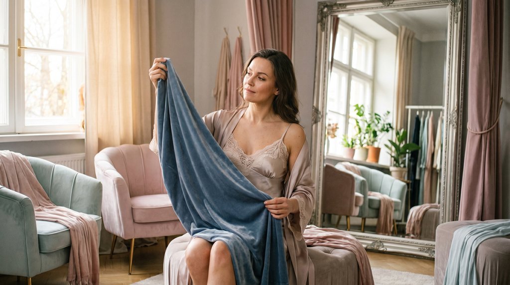
Think of lingerie as the frame for your most intimate experiences. The right frame doesn’t compete with what’s inside it — it amplifies everything. To choose that frame correctly, you first need to know exactly which undertone you’re working with.
The Diagnostic: How to Find Your Skin Undertone in Seconds
Knowing how to find your skin undertone takes less than five minutes — and the four tests below will give you a clear, confident answer.
The fastest starting point is your inner wrist. According to Healthline, cool undertones typically show veins that appear blue or purple, while warm undertones reveal a greenish tint. Neutral undertones often see both colors equally. Check in natural daylight for the most accurate read — artificial lighting skews the result.
The Jewelry Test confirms what your veins suggest. Hold a silver piece against your bare skin, then swap it for gold. Silver tends to make cool-toned skin look luminous and sharp. Gold, on the other hand, enriches warm skin with a healthy glow. If both metals look equally flattering, neutral undertone is your answer.
The White Paper Test strips away distractions. Press a plain white sheet next to your face with no makeup on. Notice what the contrast reveals: a pink or rosy cast signals cool undertones, a yellow or peachy cast points to warm, and little to no visible cast suggests neutral.
The Sun Reaction Test adds a biological layer of confirmation. Warm and olive undertones typically tan before they burn — melanin responds quickly to UV exposure. Cool undertones, by contrast, tend to burn first and tan reluctantly. This isn’t about skin tone depth; it’s about how your pigment is wired.
| Test | Cool Undertone | Warm Undertone | Neutral Undertone |
|---|---|---|---|
| Vein color | Blue/purple | Green | Both |
| Jewelry | Silver flatters | Gold flatters | Both work |
| White paper | Pink/rosy cast | Yellow/peachy cast | No strong cast |
| Sun reaction | Burns first | Tans first | Gradual, mixed |
Once you’ve confirmed your undertone, the real reward begins — discovering which colors transform your look entirely. For cool skin, that conversation starts with jewel tones.
The Cool Palette: Jewel Tones and Icy Sophistication
Cool undertones and jewel tones share a visual frequency — put them together, and the result is an effortlessly polished, high-end look.
Now that you’ve identified where you land on the warm vs cool skin undertones spectrum, the real reward begins: building a color palette that makes your skin glow rather than fade. For cool undertones, the science is clear. According to Healthline, cool undertones pair best with jewel tones like emerald and sapphire to create a harmonious visual profile — and that principle applies just as powerfully to lingerie as it does to clothing.
Why jewel tones work: The depth of colors like emerald green, sapphire blue, and amethyst purple mirrors the cool, bluish-pink pigments sitting beneath the skin’s surface. Rather than competing with those undertones, they amplify them — creating contrast that reads as luminous, not jarring.
The ‘icy’ pastel effect follows a similar logic. Powder blue, lavender, and blush-with-grey-undertones all share a cool base note that echoes the skin’s natural hue. They illuminate without overwhelming, keeping the overall aesthetic clean and sophisticated.
On the other hand, muddy earth tones — think warm terracotta, caramel, or olive — actively work against cool skin. They introduce a yellow-orange frequency the skin simply doesn’t reflect, leaving the complexion looking dull and washed out.
For those who incorporate premium wellness devices into their self-care rituals, jewel-toned accessories and fabrics create a sleek, cohesive aesthetic against cool skin — the rich saturation of the color and the smooth texture of high-quality materials share a sense of refined intentionality.
Cool-tone must-haves at a glance:
- Emerald green — rich and grounding, creates striking contrast
- Sapphire blue — deepens cool pigments for a polished finish
- Amethyst purple — harmonizes with pink and blue undertones effortlessly
- Icy lavender — soft yet luminous, never washed out
- Powder blue — a cool pastel that brightens without competing
- Silver-toned whites — crisp and clean, unlike warm ivory alternatives
If warm golds and earthy tones are the opposite end of this equation, understanding exactly what makes them work for other skin types is equally illuminating — and that’s precisely where we’re headed next.
The Warm Palette: Earthy Radiance and Golden Glows
Warm undertones and earth-toned lingerie create a synergy that feels less like fashion and more like the skin is lit from within.
Where jewel tones work their magic on cool skin, warm undertones respond to a completely different frequency. According to Healthline, warm undertones are complemented by earth tones, gold, and olive — colors that mirror and amplify the skin’s natural golden pigments rather than compete with them.
Color palette. When you choose lingerie according to your skin tone, three shades consistently deliver for warm undertones:
- Olive green — echoes the yellow-green pigments in warm skin, creating seamless, luminous contrast
- Mustard yellow — bold but harmonious, it intensifies the golden quality without overwhelming
- Deep orange and terracotta — pull out amber undertones and create that coveted bronzed effect
The bronze effect is worth understanding on its own terms. Warm skin already carries a natural luminosity — the right color doesn’t add glow so much as reveal it. Terracotta and copper-toned fabrics act like a filter, reflecting back the warmth that’s already there.
Gold hardware on lingerie is a non-negotiable for warm undertones. Silver metal details can read cold and disconnected against golden skin; gold clasps, rings, and sliders feel intentional, unified, and decidedly luxurious.
What to avoid. Stark, bright whites — the kind that appear almost blue under light — can look clinical and harsh against warm, golden skin tones. Opt for cream, ivory, or warm white instead if you want a pale neutral option.
One caveat: these are guidelines, not rules. Personal preference and the specific depth of your skin tone both matter. If neutral undertones describe you best, the next section explores a more flexible approach — one that borrows freely from both sides of the spectrum.
The Neutral Advantage: Versatility and Muted Elegance
Neutral undertones are the rare exception in skin tone theory — they don’t have to choose sides, and that freedom opens up a wider range of flattering colors than either warm or cool skin enjoys alone.
According to Healthline, neutral undertones have the flexibility to wear almost any spectrum, particularly muted “dusty” shades like rose, grey, and sage. These colors sit between full saturation and true neutrality — soft enough to avoid clashing, rich enough to feel intentional. When thinking about the best lingerie for skin undertones, neutral skin is genuinely the most forgiving canvas to work with.
Dusty hues are where neutral undertones genuinely shine. A dusty rose reads as romantic without overwhelming the skin’s natural warmth. Soft sage brings in an earthy coolness that complements the balanced undertone. Muted grey adds a modern, editorial edge that neither warm nor cool skin can pull off as cleanly.
However, the flexibility of neutral undertones comes with one real risk: middle-of-the-road fatigue. Reaching for beige, soft white, and blush on repeat creates a look that quietly disappears against the skin rather than complementing it. The fix isn’t to abandon muted tones — it’s to ensure those tones carry enough saturation to register visually. A dusty mauve with depth reads completely differently than a washed-out pink.
Style Tip: If you have neutral undertones, anchor one piece in a dusty jewel tone — think muted plum or faded teal — and let the rest of the look stay soft. The contrast adds dimension without breaking the tonal harmony.
Neutral-toned lingerie also works as a visual backdrop for brightly colored or high-tech intimate accessories, letting vibrant designs claim attention. That tension between understated and bold is a concept worth exploring further — and it connects directly to how contrast itself can become a deliberate styling strategy.
The Power Aesthetic: Using High Contrast to Highlight Body Contours
Contrast isn’t just a visual trick — it’s a deliberate strategy rooted in lingerie color psychology that directs attention exactly where you want it.
According to Cosmopolitan, high-contrast color selection creates a “power aesthetic” that highlights body contours and draws attention to specific physical features. The principle is straightforward: when a color sits at the opposite end of the depth spectrum from your skin tone, it creates a visual boundary — a frame — that the eye instinctively follows.
The Framing Effect
- Bright white on deep skin tones produces one of the most dramatic frames possible. The stark luminance against rich melanin draws the eye to every curve the fabric traces.
- Deep burgundy or navy on pale skin works in reverse, grounding light skin within a rich, saturated border that sharpens the body’s silhouette.
- The rule of depth: the greater the contrast between fabric and skin, the more defined and deliberate the visual “frame” becomes.
In practice, this framing concentrates attention on specific zones — the décolletage, waist, or pelvic area — turning lingerie into something closer to visual choreography.
The Visual Journey
High contrast guides the eye along a path. A high-cut brief in a contrasting color, for example, naturally draws attention toward the hips and pelvis. This isn’t coincidental; it’s the body’s visual hierarchy responding to tonal interruption. For those incorporating positioning that deepens sensation, intentional color framing amplifies the entire aesthetic experience — the lingerie becomes part of the moment, not just background.
However, contrast isn’t always the goal. Sometimes, a seamless, skin-melting match is the more powerful choice — which is exactly where the concept of “nude” deserves a much closer look.
The Evolution of Nude: Finding Your Seamless Match
Nude is not a color — it’s a category, and finding your specific shade within it is the difference between lingerie that disappears into your skin and lingerie that reads as beige.
For decades, “nude” meant a single pale-pink tone that worked for a narrow slice of skin tones. That era is over. As Vogue Business notes, the ‘True Nude’ concept has evolved from a single beige tone to a diverse spectrum that must match the skin’s depth to create a seamless, high-end look. The result is a four-tier framework that actually accounts for the full range of human skin.
The four depth categories of nude:
- Pale Porcelain — Look for shades labeled “ivory,” “blush,” or “champagne.” Tones with pink or cool undertones prevent the washed-out effect that warm beiges create on fair skin.
- Light to Medium Olive — “Sand,” “nude rose,” or “warm taupe” tend to harmonize with the yellow-green cast common in olive complexions without creating harsh contrast.
- Medium Bronze — Shades like “caramel,” “café au lait,” or “honey” mirror the warmth of medium-to-tan skin depths, keeping the tonal match intact.
- Deep Espresso — Rich “cocoa,” “mahogany,” or “deep mocha” tones are the only shades that genuinely disappear against deeper complexions — anything lighter reads as a visible contrast layer.
The invisible look is a deliberate styling strategy, not a default. When nude is matched correctly to skin depth, the lingerie recedes visually, which allows other elements — texture, silhouette, or premium wellness accessories — to command full attention. On the other hand, a mismatched nude can create more visual noise than a bold color ever would.
Getting this right comes down to knowing your undertone and your depth simultaneously — which is exactly what the next section’s cheat sheet will help you lock in.
The Bottom Line: Your Lingerie Color Cheat Sheet
Choosing lingerie that truly pops comes down to one foundational principle: know your undertone, then build your palette from there.
According to Psychology Today, approximately 45% of women feel more confident and empowered when wearing lingerie that specifically complements their natural skin tone — and that number alone makes the science worth understanding.
Here’s a distilled reference you can return to whenever you’re shopping:
- Start with undertone identification. Before anything else, run the vein test (blue-purple veins = cool, green veins = warm, both = neutral) or the jewelry test. This single step unlocks every color decision that follows.
- Cool undertones: reach for jewel saturations. Emerald, sapphire, amethyst, and icy blue-pinks create vivid, high-impact contrast against cool-toned skin. These rich, saturated shades make the complexion look luminous rather than washed out.
- Warm undertones: lean into earthy depth. Olive, mustard, terracotta, warm coral, and burnished gold work in harmony with golden or yellow-based skin. These hues don’t compete — they amplify.
- Use high contrast intentionally. As covered earlier in the Power Aesthetic section, pairing deep tones against lighter skin (or vice versa) frames body contours and draws the eye with purpose. Contrast is a tool, not an accident.
- Confidence is the ultimate variable. Color theory provides the framework, but the color that makes you stand taller in front of the mirror always wins. The “right” lingerie color is the one you feel most powerful wearing.
Even with this cheat sheet in hand, specific questions tend to come up — about tanning, partner preferences, and whether hair color changes the equation. The next section tackles those head-on.
Frequently Asked Questions About Lingerie and Skin Tones
Your undertone is fixed — but how you work with it is endlessly flexible. These common questions address the edge cases that trip up even the most color-aware shoppers.
Does my hair color change my skin undertone?
No. As Healthline notes, hair color can shift which shades within a color family look most flattering on you, but it does not change your biological undertone. A warm undertone stays warm whether your hair is platinum or jet black. Hair color influences your overall visual palette — it does not rewrite your skin’s chemistry.
Can I wear black lingerie regardless of my undertone?
Yes, but depth matters more than most people realize. Cool undertones tend to shine in true, blue-black shades, while warm undertones look more at home in softer, off-black or charcoal tones. Black is universally wearable — the right version of black is undertone-specific.
How do I choose colors for partner play vs. solo wear?
In practice, solo wear is about what makes you feel confident when you look in the mirror — lean into your most flattering undertone-matched shades. For partner play, bold contrast colors (think deep burgundy or striking cobalt) tend to read as visually dynamic from a distance, regardless of undertone precision.
What if I have a tan?
Your undertone remains exactly the same. What changes is your skin’s depth — the overall lightness or darkness. A tan simply means you can afford to push into richer, more saturated versions of your undertone’s palette without those colors overwhelming your complexion.
Understanding your undertone isn’t a rigid rulebook — it’s a starting framework. Use it to shop smarter, dress with intention, and stop guessing why some colors work and others fall flat.